Hey! My name's Joe and this is where I'll post my notes & work related to my A2 media studies over the next year or so.
Showing posts with label Research into digipaks and magazine advertisements. Show all posts

Monday, 26 January 2015

Ideas for my Digipak and Magazine Advertisement

For my digipak and magazine advertisement, I will be making alternative artwork for my artist's recently released album, "Struggle", as the artwork for his upcoming EP and LP have been made already.
The current artwork for Struggle is a drawn image of a boat in a bottle at sea (see right), with the "message in a bottle" connotation symbolising hope, which, contrasted with the title of the word "Struggle", to me suggests finding things that give hope to get through a tough time. From the digipaks I have analysed (Deaf Havana's "Old Souls" and Real Friends' "Maybe This Place is the Same and We're Just Changing"), I thought it would be good to create a sense of freedom, and thought the way in which Deaf Havana used the child to create a sense of vulnerability and freedom simultaneously as well as a blank canvas was very effective as it was subtle. From my audience research I have also found that my artist is similar to this band and hence I can draw from it for inspiration in my ancillary pieces. I also wanted to create a link to my music video for "Real Talk" in the artwork as this is common amongst digipaks from my research. 

So, I decided I would take some photos of things I thought were not only striking, but perhaps warming. So, when out walking my Dog, Macie, one sunny morning, I took some photos of her on the field where my video opens and where the man from the video, Elliott, is seen at the end. My favourite photo(s) were of when she ran towards me when I was taking a low angle of the field, shown below.


I think these photos would be good for the front cover of the digipak, as they are eye catching and also capture many different ideas- using a dog, not a human, in the digipak, is engaging, as it is subtle. The bright colours will connote happiness and the image is meant to be uplifting and bright, ie it looks like the dog is smiling too, and then in the centre will be the album title, Struggle, creating a juxtaposition that will hopefully connote using the good things to get through the bad- which could be seen semantically in the dog running. I will edit the image in Photoshop to create a front cover design.

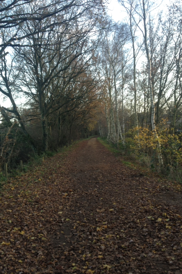
For the Magazine advertisement, I had it set that I would have a near symmetrical image taken on Marriott's Way in the Autumn, as the band and album has a very autumnal feel to me- although these images were taken in December/January, the path is covered by brown leaves and the trees still looks quite brown with some colour in the foreground. I think this would benefit the advertisement as it will help a bright album cover to stand out against a slightly darkened background and text would be easy to read. Below are my two shot variations for the magazine advertisement. Alternatively, I could use the other shot from the field to continue the bright themes and give a sense of continuity in the design.

 For the inside of the digipak, I had in mind creating a similar effect to in Deaf Havana's "Old Souls" rather than the Real Friends album, which was creating a continuous image which the Uses and Gratifications model could be applied to where my audience will make of it what they will, whilst it will humbly represent my artist. The image below is similar to that of a shot I use in the video for when I introduce the song name, looking up through the trees on a clear bright day, but this time the leaves are mostly gone- semantically, bare trees are synonymous with winter, which in turn is synonymous with darkness, even in health with seasonal or winter depression, linking to the title of the album and the challenging theme of countering that with good things, in this sense brightness, a clear representation through the light vs dark theme. Although I am unsure about this image and making it work for the interior of a digipak, I definitely want to create a similar shot, possibly using a wide angle lens or panoramic image. I am also unsure as to whether I will have a 4 or 6 panel digipak and hence where the CD will be stored in relation to the image, and how the CD and image will interact, if it all. From the images I have at present, it makes sense to do a 4 panel digipak, but I will see what works through trialing in CS6 Photoshop.

Lastly I am quite set on the back cover- an image taken from the day of the shoot for this section of the video, although I only used the shot where I begin to tilt down from the trees above to an image like this. I may include a similar image in the start or end of the video where I have several seemingly unrelated images after one another. The symmetry of the image is created by the straight path and a vanishing effect at the end, giving a sense of a long road ahead but also direction, themes that can all link to the word "Struggle". Forest and woodland walks like this are also therapeutic to many and so people may find environments like this comforting, and the brightness of the image from the blue sky also helps to create a positive feel. The text for the tracklisting will be centre aligned and will go down the middle of the pathway so that there are trees either side. The text on all of the artwork will be the same font that I use in the video to create a house style, as in Abandoning Sunday's artwork for Struggle it is a new font that was also seen in In Your Dreams. It will not be overly large and will instead be small but easy enough to read, so that it remains subtle and in keeping with a "less-is-more" theme that I am trying to achieve with my designs, to create more meaning rather than taking any photo. At the bottom of this image will be some small print, typical of rear covers, a barcode and other details. The inside cover will contain details about the songs and artist. I am unsure about whether or not producing a lyric booklet is necessary or not, but it is still a thought to consider.

Monday, 6 October 2014

Magazine Advertisement // Deaf Havana

Norfolk based Rock Band Deaf Havana are the band that I most liken to the Artist I will be working with, Abandoning Sunday, and so I have chosen to compliment my analysis of one of their videos and their digipak with an analysis of their Tour Poster for their October tour last year in support of their new album, "Old Souls". I feel analysing this artist's work will help inform me with regard to what I will be producing, as their lyrical style, appearance and music genre is similar to that of my artist.


This poster was created to advertise the tour that the band were undergoing around the release of their new album. When doing a tour around an album, it would be expected that the artwork would be similar to that of the album artwork, however besides the font type and colour, a different colour scheme is used. This may be due to the fact that, for the digipak, the band doesn't feature at all, whereas in this poster the band are all pictured. This has been done to show the newer audiences what the band actually look like as they will be seeing them live. The blue themes from the digipak were continued in the later UK tour in April 2014, which was subsequently dubbed the "Old Souls" tour.

The inclusion of the band at the top of the poster immediately captures the audience, with front man James being pictured centrally. At first, the audience is under the impression that they are all dressed formally, i.e. James is shown in a grey suit jacket, and other members are wearing waistcoats or shirts, whereas some members are just wearing plain coats. This could mirror the different audiences the band may have due to their styles- they still appear to some as a strong rock band, but the new singles that were released prior to this tour were influenced by some folk rock, and this formal appearance perhaps reflects the sophisticated nature of the band. Combined with the continued humble appearance, this will help to sell more tickets to the concerts, as more people will view the band and feel as if they will like them just from their appearance.

This impression of sophistication continues in the house style- the lattice style border that separates the image from the tour dates has connotations of wealth (which the band don't have, they cancelled a tour due to a lack of funds) and perhaps upper class. This could perhaps indicate the band maturing and becoming established. The background appears to have a wallpaper style, with the text having the same font and colour as that used in the digipak for Old Souls. The album has been included at the bottom due to the tour being done around the album, ultimately to increase sales of both the album and tour tickets.

Another way that the poster may help to promote the band and increase sales of the tour tickets is the inclusion of the support acts. "Very Special Guest" makes the support act seem very important, and former Busted front-man Charlie Simpson has had a very successful solo career exploring similar genres to Deaf Havana. If people who like Charlie Simpson's music, or recognise the name from Busted and the style that they had many years ago, more people will come to the gig, perhaps not to see Deaf Havana as a priority, but they will still see the band perform live and could grow to like them and purchase the album.

Although the poster helps to create slightly different connotations of the band and attract different audiences, I will probably try to avoid making something completely different and create continuity through my pieces, for instance if I was producing a tour poster for this band surrounding the album I would continue the blue colour scheme and coastal themes from the digipak, or maybe include a still from an associated music video. However, the advertisement does create strong links to what the band is like, genre-wise and personality wise, and gives a distinct message to the bands fans, which is something I will try to utilise - and I will just be producing the magazine advertisement for the digipak, not a set of tour dates, so I will try to continue similar themes across my products.

Friday, 19 September 2014

Digipak Analysis: Deaf Havana // "Old Souls"

"Old Souls" is the third album by British alternative rock band Deaf Havana, an album which marked yet another direction change from the band to more classic rock, with hints of folk rock and chorus-driven songs. The previous record, "Fools & Worthless Liars", established the band from Hunstanton as one of the most popular current British Bands, but the change from debut album, "Meet Me Halfway, At Least" which featured the single "Friends Like These", seems like an entirely different band to what the Norfolk band's music is like today. That being said, the success of "Old Souls" is unparalleled - singles "Boston Square" and "Mildred" were Zane Lowe's Hottest Record of the World, and the album reached #9, the first Top ten album for the band. This is the original version of the Digipak, and it is one of the most simplistic designs of a digipak I own- however, it works in the bands favour and matches their ideals.

The front cover of the album features a small child running across the beach, with a small group of people in the background. The open blue skies and background create connotations of freedom. The text takes up a relatively small portion of the cover. Also the use of the child instead of an adult creates a sense of vulnerability but I see it as a humble representation of the band- themes are parallel to those utilised in lead single "Mildred" (see end), and could show that although the band face many difficulties (they recently cancelled a tour as they didn't have the funds), they still try to live a carefree life.

The inside of the digipak leaves a lot open to interpretation. It continues the themes created in the front cover by using the same background but it also contains no other images other than the open coastal scene depicted. The band hold close ties to their coastal hometown of Hunstanton (see analysis of Hunstanton Pier) and this could be why for "Old Souls" the band chose to use this coastal image. Other than this image it is blank, perhaps indicating that this is who the band are, there is nothing else to know about them, no secrets, it is all open to their audience - this matches the tracks as track "Caro Padre" is the first time that lead singer James opens up about his relationship with his Father, as well as other relations like in "Mildred", regarding an old friend. The lack of images of the artist also suggests that three albums in, the band do not need to portray themselves, despite their apparent change in style- perhaps the band could've included them wearing different apparel to connote the change from the post-hardcore genre to alternative rock, as they did in the video to "Smiles All Round" (2010) where the band are depicted wearing hoodies and appearing very "punk", but this was perhaps previously illustrated in the previous album artworks (see bottom.) An alternative consideration lends itself more towards the Uses and Gratifications model, which states that audiences seek out the media that they wish to consume, and focuses on what the audience does with the media text, rather than what the media does to audiences. Where other bands would perhaps overtly brand themselves over their covers where audiences are given a prescribed view, the blank canvas of the inside cover creates an open interpretation of the band for the audience to make their own "use" of, and decide what it symbolises in terms of the bands ideologies. This is a much more descriptive approach in which there is no set idea of the band given in the digipak, making them more accessible to wider audiences, who may feel that they can get in to the bands music for this reason.

The rear cover also continues the coastal theme and keeps the same background creating a sense of continuity to the digipak, making it aesthetically pleasing with a nice layout. The tracklist is in the same colour as the album details at the front of the digipak, and takes up very little space on the back cover, which is strange as it depicts no other scenes, so the tracks could take up more space, but the band clearly felt this was not necessary, probably as it continues the humble theme and ideals that the band creates - the audience know what songs are going to be on the album as the band have a very strong fanbase. For those who do not know the artist, again continuing the idea of the uses and gratifications model, this will not create a negative effect as it is still organised and clear, and open/revealing so the audience does not feel put off.The rear cover also has the record label at the bottom and a few copyright details, which again fit the house style of the digipak and are a common feature of any CD artwork. The audience may also recognise this record label and associate this with other acts, particularly those that do not know the artist, but knows of other acts on the same record label.

Here are the two previous album covers from the two prior LPs the band have released. Left, "Fools & Worthless Liars" (2011) contained singles "I'm A Bore, Mostly" and "Hunstanton Pier" . However, "Meet Me Halfway, At Least" (right) flaunted a much different Deaf Havana, that tended more towards heavier bands such as Enter Shikari both vocally and instrumentally. The single "Friends Like These" was the track that got the band well-known, but subsequently the bands style changed significantly, which is reflected in the artwork changes- the first album seems edgy, whereas Fools & Worthless Liars' artwork is more sophisticated, with a classic tone and much more humble appearance. The colour scheme is the more notable change from F&WL to Old Souls, with the dark colours being traded for sky blue, perhaps reflecting the change in mood of the songs, despite how some of them are still quite sad ("Everybody's Dancing and I Want To Die", "Caro Padre") - the lyrics remain quite depressing and sad yet the instrumentals are infinitely more uplifting and not as aggressive as in the earlier records. This could be a reason for the change in themes in the artwork over time.

It should be noted that the theme of children continues from the digipaks into the music videos. The video for the lead single from "Old Souls", "Mildred (Lost A Friend)", follows two children throughout the video, one of whom bears a striking resemblance to the same child used on the front cover of "Fools & Worthless Liars", It does depict the children as doing some adult tasks, such as working in an office, and does also feature several shots by a beach, continuing the coastal theme of this digipak. The video, like the digipak, also does not feature the band at all, (although "22" and most of their other videos have featured them, for instance Hunstanton Pier which I analysed) enhancing the humble representations suggested by the designs. Furthermore, it could show how the band, although tied down with day to day life, still live like children, in their own world (particularly shown by the very last shot in the video, where Earth is shown in the sky above the two "friends" that the song talks about). The song itself is about an old friend of the guitarist who they no longer see, as said in an interview on Radio 1, (contrary to belief that it was about Ryan Mellor, the screamer vocalist who left the band), and corresponds to what I was saying for the middle section of the digipak and Caro Padre, where the band are being open and have nothing to hide about themselves and their relations with others.

- Althusser - child - audience represent self in text.
- misrepresentation

Digipak Analysis: Real Friends // "Maybe This Place Is The Same And We're Just Changing"

Released on 22/7/2014, "Maybe This Place is the Same and We're Just Changing" is the debut record from Illinois Pop Punk Band Real Friends. Signed to Fearless Records, Real Friends have released several EPs and built up a devoted following amongst the pop punk scene, and played the Warped Tour in 2014 on the Journeys Stage. The band recently toured the UK with Modern Baseball and You Blew It! and are now touring America with the UK's most renowned pop punk band and hyped band overall Neck Deep. From these tours, it is apparent that the band are already well known in this industry and this could explain some of the choices made in their artwork. Only a digipak and vinyl version of this record is available at the moment, and this is a common feature of pop punk bands who only release the digipak version over a jewel case (i.e. Neck Deep "Wishful Thinking", Citizen "Youth", The Wonder Years "The Greatest Generation"), proving that the digipak is in fact more popular and preferred over the jewel case in this genre. This could be because the pop punk genre is in a "rejuvenation" phase, with tours such as Pop Punks Not Dead! revitalising the popularity of the subgenre that Blink-182 and similar bands made so popular. The preference of the digipak over the jewel case hence could be because it allows for much more images and meaning to be connoted through the design of the digipak and allow for more promotion of the artist. Common lyrical themes amongst Real Friends songs include sadness and trouble moving on, perhaps the reason behind the album title, as I will explore in this analysis. 

This is the front cover of the Digipak for Maybe This Place Is The Same And We're Just Changing. As you can see, the band rely solely on imagery and the digipak does not feature the band at all. This could be because the image of the band has already been created through the previous EPs and from doing several tours to become recognised in this genre. A house style utilising the colours blue, yellow and white is also created which the rest of the the digipak will adhere to, appealing to the audience aesthetically - Real Friends' previous EPs have not been so artistically constructed and feature rough images or ambiguous ones. The front of the digipak may seem ambiguous at first, but a meaning can soon be established. From the lyrical content of the bands songs, the locked chest could hold semantic meanings of having thoughts trapped and how the album contains these thoughts.

The inside of the digipak continues the themes established by the front cover - still no images of the band are present, and other images of a town and stills of a room are featured, with a vase of flowers on the left which the band also used on posters. The town most directly links with the name of the album, "Maybe This Place is the Same and We're Just Changing", saying that "this place" is the town, Illinois, where the band hail from (the album also features a track called "Spread Me All Over Illinois" further supporting this idea". The borders between the images give it a professional apperance but one that is also very aesthetic and nice to look at. The lack of images of the band is strange because in order to create a motif of the band and appeal to new audiences by including an image of the 5-piece, the band have chosen to simply use images. This could be due to their largely metaphorical lyrics "I miss you like the summer" etc. and how it leaves their audience to decide the meaning of the images and the lyrics for themselves. The digipak lends itself to Hall's Reception Theory, in that the text is encoded with a meaning or representation of the band, and different audiences respond or decode the text in different ways, meaning the images seen throughout the digipak can be interpreted in different manners by different audiences; i.e. they nay see the images to represent something else due to their ambiguous nature. The interplay of the images suggests that they are all interlinked in some way, and their simple nature suggests that they all mean something to the band, but may represent something else entirely to the audience.

On the back cover of the digipak is the tracklist, record label and details and again a continuation of the imagery that we observe on the front cover. The tracklist, of 12 songs, takes up relatively little space, and the main focus of the design is the bookshelf. This again relates back to the album title, "Maybe this Place is the Same...", as it is suggesting that these images depicted, such as the rooms, have not changed at all (similarly to La Dispute's latest release, Rooms of the House) and that they are much the same and ordinary. The font is clear to read and not in an overt font, which is typical of the pop punk genre in digipaks, and also could the order and neatness of the images could contrast the angst in the songs and perhaps chaos that the band articulates into the 12 tracks, ranging from slow sad songs such as "Sixteen", songs about failed relationships and the associated thoughts ("I Don't Love You Anymore") and self-depreciation and angst, particularly from lead single "Loose Ends". The inclusion of the production details on the back cover perhaps shows the humble nature of the band (the thankyous are on the lyric sheet inside the album), and how they are grateful for how the record label have supported them. Fearless Records also hold host to a wide variety of alternative bands, from metalcore acts such as Blessthefall, Motionless in White, The Word Alive and August Burns Red,  as well as more mainstream, "radio-friendly" bands such as Go Radio, The Downtown Fiction, Plain White T's the hugely popular American EDM/Punk band Breathe Carolina, pop rockers The Summer Set and famous pop punk band Mayday Parade. The vastness of the amount of bands on the label and the variety of genres means that by including the record label logo, people can identify the logo and match that with what the label includes and hence if they will like it, which will ultimately increase sales. The simplicity of the digipak makes it easily accesible to new audiences and current audiences alike which will increase the popularity of the band and widen their fan base.

Real Friends have continued themes from their previous EPs. Above are three releases, "Put Yourself Back Together" (2013), "Three Songs About the Past Year of my Life" (2012) and "Everyone That Dragged You Here" (2012). From these we can observe many themes that Real Friends have carried onto the debut LP. These albums were all released on BandCamp, with CD versions of the more recent EPs becoming available to UK audiences on Amazon. White text for the band and text is used in all three designs, and once again the band is not featured in any of them, only images, perhaps again of home town Illinois as referencing home-towns is a common stereotype of pop punk bands. The band have gained recognition from these three EPs without utilising images of themselves, so there is no need to "sell out" in a sense and start self-promotion since signing to Fearless as they already have a strong fan base and can stick to the bands morals and ideals.