This is the design for my Digipak. In this post, I will proceed to explain why I have chosen each of these images and explain how I produced them.

Above is the Design for my Front Cover of my Digipak. I opted for a simplistic image that in it's composition presents many different meanings. The design lends itself to the Reception Theory, in that I, the author of the text, have encoded it with a desired, preferred meaning through taking the image, and my audience may agree with this or see it differently. Alternatively, the Uses and Gratifications model could be considered, as the image is relatively simplistic and the audience can make of it what they will, to fit their needs and what they are looking for in a digipak.
The image itself was taken on the same day as all other images in the digipak, at Thorpe Marriott Green, a public park. To take this photo, I positioned myself crouched at the bottom of a slight slope in the field, and framed the shot so that the sun was in the top right of the image and the field posed as a backdrop. I then called my dog, the West highland Terrier in the photo, who started at the far end of the field, and ran towards me.
I decided this was an apt image for my digipak by playing off of the album's name, which I knew to be "Struggle". The term struggle, relating to a time of endearment through a difficult period, due to whatever circumstances, is negative, but many believe that to have struggled shows strength. I decided I wanted to contrast the negativity of the album title, which would have a prominent position in the image, by juxtaposing it with a positive, uplifting image, which I could get from this shoot. The dog running connotes a sense of freedom- it is off it's lead, and is free to go wherever it chooses. By using a dog, I make it universally relatable, as it is so different to a person- no social bias is percieved, reaching a wider audience. The dog running through the field also suggests that the "struggle" can be beaten, or that it in fact, isn't real. The design is inspired by the digipak I analysed, Deaf Havana's "Old Souls". This "preferred" reading is the one I have encoded, however as it is a simple image, the audience may see it how they choose, meaning it could be decoded in different ways.
In the post-production part, in Photoshop I edited the photo by cropping it to the desired size but keeping the original ratio. I then proceeded to edit the Levels to bring the colour out more, before adding a Warming Filter at 20% to make the image seem more like summer. This filter also accentuated the band of sunlight seen in the top of the image in the sky and enhances the lens flare at the top right and bottom right corners.

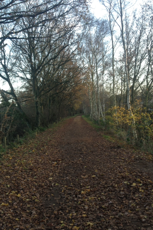
This is the back cover for my Digipak. This was shot down Marriott's Way, where it passes through Thorpe Marriott Green and is near to where the front cover was shot. On a different day, I ensured the weather was similar before taking this shot, as I knew I wanted to have continuity between the covers of my digipak. Again this image lends itself to Reception theory and I have chosen it for a reason that relates to the album title and message of the album's lyrics.
I took this image by crouching just before a slightly raised area of the former railway line where the path crosses into the more suburban area- I did this in order to capture a more symmetrical image. This shot was also intended to have a vanishing point, visible before the track list was added, as this section of the track is long and straight. I chose this section over a more open area as the trees give a symmetrical feel to the image and this helps to create meanings- the encoded meaning in this image is that the audience/viewer, is on a path (metaphorically and literally). This path may seem monotonous and endless, but ultimately there is an end- the brightness of the image contrasts the literal meaning of the word "struggle" like in the front cover. The shaded areas could be seen as representative of these struggles along the path, and the brighter areas offering the positives- a simple Light vs. Dark analogy that gives clear connotations that relate back to "the struggle". The image, as a whole, was partially inspired in the initial process by the opening line to Dante's "Divine Comedy", in "Inferno, Canto I" which famously states:
"Midway upon the journey of our life, I found myself with a forest dark, for the straight foreward pathway had been lost"
This is also in keeping with the scenes in my Music Video, where my character finds himself lost in the forest, looking for his way out, which he finds via a Beach, and then his friends. This too aligns with my artists religious undertones, as Dante's epic poem is one the most prestigious pieces of religious literature of human history.
In Photoshop, I first edited the image by bringing out the colours by adjusting the levels. The image was taken on my iPhone camera and so quality was high. I then applied the same filter as I did with the front cover to give continuity. I then used the same type face, "Please Write Me A Song", that I used in the video for "Real Talk", as well as the Magazine Advertisement and the front cover, to type out the track listing for the album, and centre aligned it using rulers. I also created a barcode using an online generator as this a common feature of digipaks and is of course necessary, and keeping it in this position avoids the confusion of the audience and seller. Also required is a Record Label and copyright information, i.e on Deaf Havana's digipak there was copyright information relating to BMG Entertainment and in Real Friends', the Fearless Records logo was in a prominent position. As my artist is unsigned, a needed to create a record label and logo, to demonstrate where it would go on my design.

My record label, "Remedy Records", takes it's name from a popular pop punk song by State Champs (Remedy) and along with the jagged font, the design may have connotations amongst part of my target audience. The two "R"'s also enable for a smooth design to be created. I made the sides of the shape with a gradient rectangle and then a colour overlay to change it to white when I inserted it into the digipak. The image will be found in my digipak and on my advertisement.

Putting the front and rear covers together, along with an extra panel, allowed me to construct the full outer of my digipak, shown above. The front and back covers have been re-sized from the square shape to fit the dimensions of a digipak, without affecting the aspect ratio (the barcode is now at the bottom of the rear cover). The notable differences here are the spines and the extra panel.
I wanted to use an extra panel in order to create continuity and to display an image that the audience would see upon opening the digipak. The image is taken from the same shoot as the front cover, making it look as though the image has slightly changed and the dog has moved. Similarly to why I used the image on the front, the picture connotes happiness and has an uplifting feel due to how the dog appears to be smiling. The lens flare remains and there is a similar filter used to the previous images that also helps to enhance the white-ness of the dog- perhaps symbolising hope, due to the connotations of the colour white in regards to Light Vs. Dark ideas and connotations. There is also a lens flare in the top right corner of the image, suggesting brightness and the associated attributes to this, combined with hope, to, effectively, bring an end to the struggle.
To construct the main spine (between front and back cover), I used Photoshop, and copied a 1cm length of the front cover, and then adjusted the size to make it look as though the image carried on- the grass and trees continue as does the shadow of the dog and trees. This also gives a sense of continuity to the digipak making it more aesthetic. I then added a shape and made it slightly transparent to darken the image to a required level which would allow the text to be clearly read. In the full version, I have the text "RR-001" at the base, a convention of spines, which has the Record Label, often as an initialism, followed by the number of the release on that label- which in my instance is of course 1. For the other spine, I extended the image out, this time using part of the original image, by keeping it an extra cm wider, and then applied the shape to make it darker. Again in the full digipak, the same text is duplicated here, in case it is placed this way around.

Lastly, this is the design for the interior of the digipak. Following my analysis of Deaf Havana's "Old Souls", I wanted a single image to take up all 3 panels of the interior of the digipak. This allows my product to be related to the reception theory and uses and gratifications models, which focus on what the audience does with media, and the way in which they interpret the image/media- I have left a lot open to the imagination with this image. However, I feel it fits in with the theme and style of my digipak and presents a great wide image to look at. Taken on the same day as the rest of the shoot at the Thorpe Marriott Green, this is also a shot I use in the music video to "Real Talk", linking my texts together.
In Photoshop, I first brought out the colour in the image by adjusting the Levels, before adding a similar Warming Filter to make it appear brighter and enhance the light from the sun on this clear day. I added darker rectangle shapes in line with where the spines are using rulers and then added circles where the CDs would be placed, showing my digipak is capable of holding two compact discs (12x12cm) or a CD and DVD. On the left panel, I have added the text of the artist and album name, before adding details about the artist. At the base, the record label logo is centred below a horizontal line, which could be used a slot for any booklet to go alongside the digipak.
Regarding the composition of the image, I moved the photo so that it was divided into three bands- the base, which is the grass, the trees, and the sky- which, technically, makes it more aesthetic, and leaves a lot open to the audience to determine- in light of the reception theory, the audience could interpret it in many ways- similarly to "Old Souls", it creates a blank canvas, indicating there are no secrets with this artist and the lyrics are honest. It could, in keeping with my previous reference, be interpreted in a religious context, in that the Divine Comedy was split into three parts, Hell, Purgatory, and Paradise. The clear skies are also symbolic of hope, and that the struggles of day to day life will clear, and the beauties of the world will become apparent- as one of my favourite musical artists Rou Reynolds [Enter Shikari] stated, "Sometimes it's beneficial to take a step back from everything and appreciate the honour it is to simply be alive. We're able to inhale air, to witness the beauty of our planet and to hear the wonders of rhythm and harmony. What a privilege it is to experience so much in such a relatively small pocket of time." It is the essence that I wanted to capture with the digipak as a whole, in direct juxtaposition with the album title of "Struggle", that there is always hope and beauty amongst the struggles that we face in life. The digipak deals with the issues that the band deal with in their lyrics, such as self-depreciation and depression, by offering a bright symbol of hope for those who enjoy the artist to find solace in.
This concludes my write-up on my Digipak production.