For my digipak and magazine advertisement, I will be making alternative artwork for my artist's recently released album, "Struggle", as the artwork for his upcoming EP and LP have been made already.

The current artwork for Struggle is a drawn image of a boat in a bottle at sea (see right), with the "message in a bottle" connotation symbolising hope, which, contrasted with the title of the word "Struggle", to me suggests finding things that give hope to get through a tough time. From the digipaks I have analysed (Deaf Havana's "Old Souls" and Real Friends' "Maybe This Place is the Same and We're Just Changing"), I thought it would be good to create a sense of freedom, and thought the way in which Deaf Havana used the child to create a sense of vulnerability and freedom simultaneously as well as a blank canvas was very effective as it was subtle. From my audience research I have also found that my artist is similar to this band and hence I can draw from it for inspiration in my ancillary pieces. I also wanted to create a link to my music video for "Real Talk" in the artwork as this is common amongst digipaks from my research.
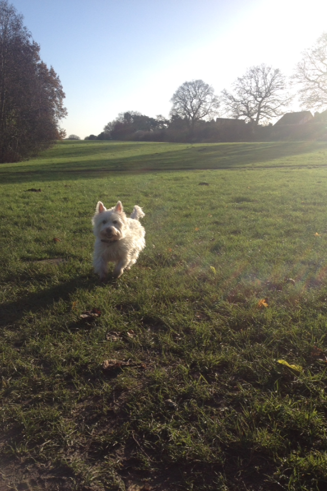
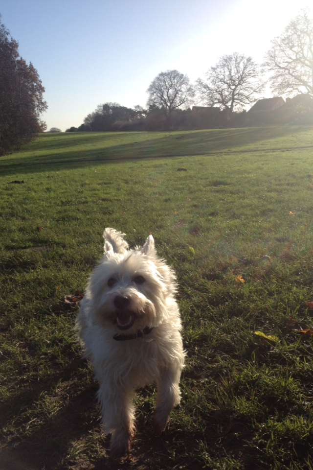
So, I decided I would take some photos of things I thought were not only striking, but perhaps warming. So, when out walking my Dog, Macie, one sunny morning, I took some photos of her on the field where my video opens and where the man from the video, Elliott, is seen at the end. My favourite photo(s) were of when she ran towards me when I was taking a low angle of the field, shown below.


I think these photos would be good for the front cover of the digipak, as they are eye catching and also capture many different ideas- using a dog, not a human, in the digipak, is engaging, as it is subtle. The bright colours will connote happiness and the image is meant to be uplifting and bright, ie it looks like the dog is smiling too, and then in the centre will be the album title, Struggle, creating a juxtaposition that will hopefully connote using the good things to get through the bad- which could be seen semantically in the dog running. I will edit the image in Photoshop to create a front cover design.
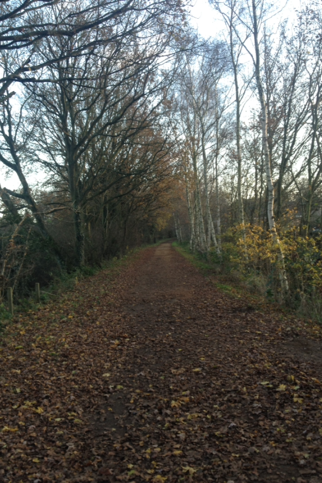
For the Magazine advertisement, I had it set that I would have a near symmetrical image taken on Marriott's Way in the Autumn, as the band and album has a very autumnal feel to me- although these images were taken in December/January, the path is covered by brown leaves and the trees still looks quite brown with some colour in the foreground. I think this would benefit the advertisement as it will help a bright album cover to stand out against a slightly darkened background and text would be easy to read. Below are my two shot variations for the magazine advertisement. Alternatively, I could use the other shot from the field to continue the bright themes and give a sense of continuity in the design.


For the inside of the digipak, I had in mind creating a similar effect to in Deaf Havana's "Old Souls" rather than the Real Friends album, which was creating a continuous image which the Uses and Gratifications model could be applied to where my audience will make of it what they will, whilst it will humbly represent my artist. The image below is similar to that of a shot I use in the video for when I introduce the song name, looking up through the trees on a clear bright day, but this time the leaves are mostly gone- semantically, bare trees are synonymous with winter, which in turn is synonymous with darkness, even in health with seasonal or winter depression, linking to the title of the album and the challenging theme of countering that with good things, in this sense brightness, a clear representation through the light vs dark theme. Although I am unsure about this image and making it work for the interior of a digipak, I definitely want to create a similar shot, possibly using a wide angle lens or panoramic image. I am also unsure as to whether I will have a 4 or 6 panel digipak and hence where the CD will be stored in relation to the image, and how the CD and image will interact, if it all. From the images I have at present, it makes sense to do a 4 panel digipak, but I will see what works through trialing in CS6 Photoshop.

Lastly I am quite set on the back cover- an image taken from the day of the shoot for this section of the video, although I only used the shot where I begin to tilt down from the trees above to an image like this. I may include a similar image in the start or end of the video where I have several seemingly unrelated images after one another. The symmetry of the image is created by the straight path and a vanishing effect at the end, giving a sense of a long road ahead but also direction, themes that can all link to the word "Struggle". Forest and woodland walks like this are also therapeutic to many and so people may find environments like this comforting, and the brightness of the image from the blue sky also helps to create a positive feel. The text for the tracklisting will be centre aligned and will go down the middle of the pathway so that there are trees either side. The text on all of the artwork will be the same font that I use in the video to create a house style, as in Abandoning Sunday's artwork for Struggle it is a new font that was also seen in In Your Dreams. It will not be overly large and will instead be small but easy enough to read, so that it remains subtle and in keeping with a "less-is-more" theme that I am trying to achieve with my designs, to create more meaning rather than taking any photo. At the bottom of this image will be some small print, typical of rear covers, a barcode and other details. The inside cover will contain details about the songs and artist. I am unsure about whether or not producing a lyric booklet is necessary or not, but it is still a thought to consider.


